


minimalist phone® Screen Time
4.75.37K Reviews
App Specs
- Version
- 1.21.9v227
- Updated On
- License
- Free
- Downloads
- 5,000,000+
- Developer
- Focus Experts
- Categories
- Productivity
- Platform
- Android, iOS
Screenshots
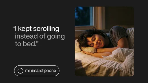
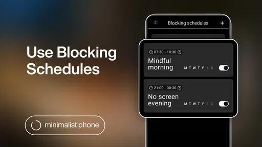
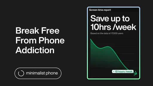
 Analysis by AppCompare
I first tried minimalist phone® - Launcher because I wanted my phone to feel less like a corridor of tempting icons and more like a tool I could use and put away. Its appeal is not that it adds another productivity system to manage; it changes the front door to the apps already on your device. That distinction matters. If your distractions begin with opening the home screen and tapping whatever catches your eye, a quieter layout can make a useful difference. If you need detailed task planning or strong controls over every app, a launcher alone may not solve the problem.
Readability and a calmer way to navigate
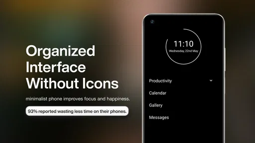
When I first installed minimalist phone® - Launcher, I was immediately struck by its clean and simple interface. The design is truly minimalistic, and that's not just a buzzword here. The app strips down your phone's interface to the essentials, giving you a streamlined and organized home screen. It's like a breath of fresh air in a world filled with digital noise.
Gone are the days of endless scrolling through pages of apps. With this launcher, you get a neat list of your most-used apps and a search bar to quickly find anything else you need. It's efficient, it's sleek, and it just works.
This text-first approach can be easier to scan than a crowded grid, especially when you already know the name of the app you want. Instead of visually picking through colorful icons, I can look for a familiar label or search. That may suit people who prefer less visual clutter, though it is not automatically better for everyone: someone who relies on recognizing icons, rather than remembering app names, may find a list less immediate at first.
The practical benefit comes from deciding what deserves a place on the main screen. I would keep only the apps I reach for with a clear purpose there, then use search for occasional needs. That small distinction turns the home screen into a deliberate starting point rather than a display of every possible distraction. It also means the setup reflects your habits, so a list curated for someone else is unlikely to be as useful as one you shape yourself.
Features that shape everyday use
One of the standout features of this launcher is the focus on productivity. By eliminating distractions, it helps you stay on task. The app's design encourages you to use your phone with intention, rather than mindlessly jumping from one app to another.
Another cool feature is the ability to customize your app list and widgets. While the launcher keeps things minimal, it doesn't sacrifice personalization. You can choose which apps appear on your home screen and even adjust the widget sizes to your liking.
Worth Reading Before You Choose

Flipboard Shows What News Apps Must Do Beyond the Feed

Switching to Android Auto Means Rethinking Your Driving Routine
Google Calendar Makes a Crowded Week Easier to Manage

Ludo King Makes the Most of the Minutes Between Plans

Baby Panda World Brings Quick Play to Modern Phones, but Its Game Library Feels Busy

ESPN’s Live Game View Makes Following Close Games Easier
And for those who appreciate a touch of elegance, the themes are a delight. You can switch between light and dark modes, depending on your mood or the time of day. It's these small touches that make the app feel polished and well-thought-out.
For a more focused setup, I would avoid treating the customizable list as a new place to put everything. Choosing a short group of tools for the first screen, while leaving less urgent apps searchable, creates a useful pause before opening them. Widgets can be helpful when they let you glance at information without opening another app, but adding too many would work against the uncluttered feel. The trade-off is straightforward: less visual choice can reduce casual tapping, but it also asks you to be comfortable finding some apps by name.
Motor, sensory, and situational considerations
The pared-back layout may help someone who finds a busy screen tiring to look at or difficult to scan. Light and dark themes offer a basic way to choose a presentation that feels more comfortable in a particular setting. I would not treat those options as a replacement for the phone’s own accessibility settings, though. People who need specific text scaling, spoken feedback, switch access, or other assistive tools should check how their usual settings behave with this launcher before relying on it throughout the day.
There is also a motor trade-off worth considering. A short app list and search can reduce the need to swipe through several home-screen pages, but search requires typing or another input method. Someone who has difficulty with precise touch gestures may prefer a familiar home screen or a layout with larger, stable targets. Because needs vary, trying the launcher with the actual apps and input settings you depend on is more useful than assuming a minimalist design will automatically be easier.
In a quiet work session, this setup can make a phone feel less inviting as a source of interruption: I can open the tool I need, complete a small task, and leave. In a busy moment, however, such as trying to find a boarding pass while carrying bags, a familiar icon or a prearranged widget may be faster than searching a list. I would keep time-sensitive essentials easy to reach and use the minimal screen to reduce optional choices, not to hide tools I may urgently need.
Performance, reliability, and the limits of a launcher
Performance-wise, minimalist phone® - Launcher is as smooth as butter. I didn't experience any lag or crashes during my time with it, which is always a plus in my book. The app is lightweight, which means it doesn't hog resources, keeping your phone running efficiently.
Usability is another area where this launcher shines. It's intuitive and easy to navigate, even if you're not particularly tech-savvy. The learning curve is practically non-existent, which means you can start enjoying the benefits right away.
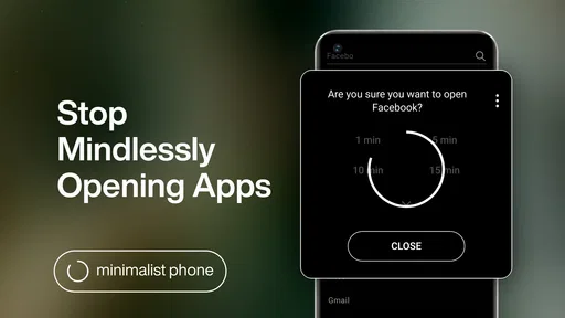
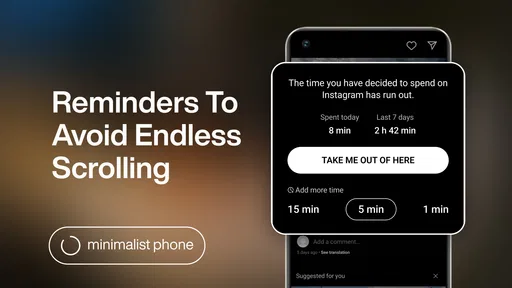
A launcher changes how you reach apps; it does not, by itself, change what happens after you open them. If a social feed or video app is where you lose time, the quieter home screen can add a moment of friction, but it cannot guarantee that you will leave the app sooner. I see that as an important expectation to set: this is a useful environmental nudge, not a complete screen-time plan or a substitute for personal limits.
Compared with a typical feature-packed launcher, the appeal here is restraint rather than elaborate icon packs, animated effects, or layers of layout controls. Compared with keeping the phone’s standard home screen and simply moving apps into folders, it offers a more deliberate change to the everyday starting point. The standard launcher may still be the better choice if you depend on a familiar grid or want extensive visual arrangement. I would choose this one when reducing the number of things competing for my attention matters more than fine-tuning every detail.
For a realistic routine, imagine sitting down to write an email during a short break. With a crowded home screen, a social app or game may catch your eye before you find mail. Here, I would place mail among the few visible choices, keep other apps available through search, and use a widget only if it genuinely saves an extra step. The setup does not make the break longer or the work easier by magic; it simply makes the intended action more obvious than the detour.
Who benefits, and who may prefer another approach
If you're someone who values simplicity and wants to cut through the clutter on your phone, this is definitely the launcher for you. It's perfect for those who want to focus on what truly matters and reduce digital distractions.
On the other hand, if you're looking for a launcher with flashy animations and tons of customization options, this might not be your cup of tea. But honestly, that's kind of the point here. It's all about embracing minimalism and efficiency.
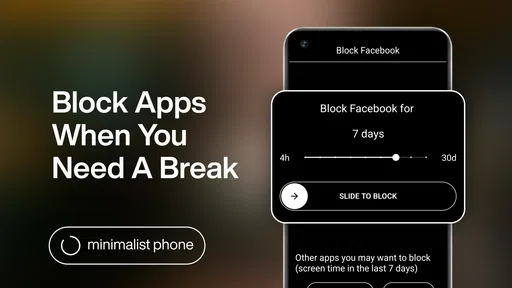
I would also hesitate to recommend it as the first choice for someone who needs every app visible at once, depends on a highly visual layout, or wants the launcher itself to block access to distracting services. A person who shares a device with others may prefer a familiar arrangement that everyone can navigate without learning a new list. For these cases, keeping the default launcher and reorganizing its home screen may be the more practical compromise.
The app is a free productivity tool from Focus Experts, with in-app purchases ranging from about 29 cents to around $60 per item. It is rated for everyone, and its current version is 1.20.1v217, with Android 6.0 as the minimum requirement. Those details make it accessible to a broad set of Android users, but the purchase range is a reason to check the individual options in the app before buying anything; the basic idea is worth evaluating on its own rather than assuming every extra is necessary.
Its audience is substantial: it has over five million installs, an average rating of 4.5 from around 47,000 ratings, and roughly 5,100 written reviews. Those figures suggest that the minimalist approach resonates with many people, but they cannot tell you whether a list-based home screen will suit your eyesight, habits, or input needs. I would judge it by a simple test: after setting up the apps you genuinely need, does reaching for the phone feel more intentional, without making important tasks harder?
A considered verdict on inclusion and focus
Overall, minimalist phone® - Launcher is a breath of fresh air in the launcher world. Its focus on simplicity and productivity is a welcome change, and it's perfect for anyone looking to declutter their digital life.
Its strongest quality is also its main compromise: it asks you to trade a familiar, icon-heavy screen for a quieter and more selective one. For some people, that can make everyday navigation feel clearer; for others, especially those who need visual recognition or quick access to many apps, it may introduce extra steps. I would try it with a small set of essential apps first, then adjust the list and widgets around real routines rather than aiming for an abstractly perfect minimalist screen.
Whether the change is worthwhile depends on what gets in your way. If visual busyness and reflexive tapping are the problem, this launcher offers a practical way to reshape the first moment of phone use. If your challenge is remembering app names, needing hands-free navigation, or managing time once inside distracting apps, a different layout or additional phone settings may serve you better. I like it most as a considered home-screen choice, not a universal fix.
Pros
- Clean
- user-friendly interface design.
- Enhances battery life with minimal resource use.
- Customizable themes for personalization.
- Intuitive gesture controls for quick access.
- Supports various widgets and shortcuts.
Cons
- Limited advanced features for power users.
- Occasional delays in app updates.
- Some customization options require a purchase.
- Not all default apps can be replaced.
- Compatibility issues with older devices.
FAQs for minimalist phone® Screen Time
What is minimalist phone® - Launcher and how does it work?
Minimalist phone® - Launcher is a mobile application designed to simplify the user interface of your smartphone. It replaces your existing home screen with a clean, distraction-free layout. The app focuses on essential functions, making it easier to access important apps and features without the clutter of unnecessary icons and notifications.
Does minimalist phone® - Launcher affect battery life?
One of the main advantages of minimalist phone® - Launcher is its lightweight design, which can potentially enhance battery life. By reducing background processes and minimizing the use of flashy animations, the launcher is optimized for efficiency, helping to conserve battery power compared to more resource-intensive launchers.
Is minimalist phone® - Launcher customizable?
Yes, minimalist phone® - Launcher offers a range of customization options. Users can adjust the appearance to suit their preferences, including changing themes, icon sizes, and grid layouts. Although it prioritizes simplicity, the app provides enough flexibility to personalize the minimalist interface according to individual needs.
Can I access all my apps with minimalist phone® - Launcher?
Absolutely. While minimalist phone® - Launcher emphasizes essential apps, you can still access all your installed applications. The app drawer is neatly organized, allowing you to locate any app quickly. This ensures that while your home screen remains uncluttered, you don’t lose access to any functionality.
Is minimalist phone® - Launcher compatible with all devices?
Minimalist phone® - Launcher is compatible with most Android devices. However, for optimal performance, it is recommended to have a smartphone running Android version 5.0 (Lollipop) or higher. As always, checking app compatibility on your specific device before downloading is a good practice.


